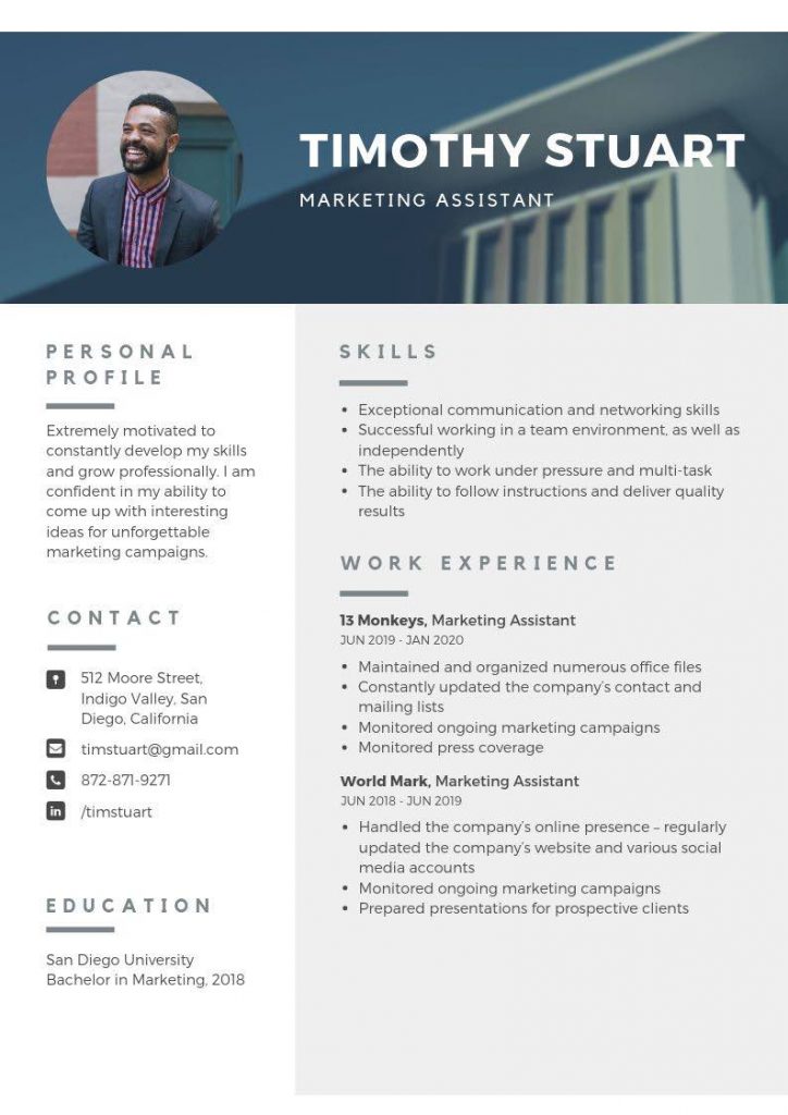
I’ve had a lot drop into my inbox lately, namely very fancy resume templates, with bells and whistles. Here is an example below, courtesy of Canva.com.
Now, Canva is fantastic resource and I fully endorse this great Australian start-up success story. But you should never use one of their resume templates, or other resume templates online similar to the one above. Why?
Technology will block your resume, and while a visually appealing document helps, if your content is poor, a fancy template is not going to help you. Let me explain further.
Applicant Tracking Systems
All the resume templates used by Canva are problematic in that they would not pass muster with Applicant Tracking Systems. Now Applicant Tracking Systems (ATS), are systems that employers use to manage job openings and it is estimated that 75% of candidates chances are killed, because a resume is not formatted in the right way, or the document does not contain the right keyword or phases.
Now all major organisations tend to use ATS Parsing Software and they are used (in spite of being flawed), because it makes life so much easier. Now the reasons why this template above would not pass an ATS, is because it does not meet the formatting requirements of ATS. These include:
- Having columns, which when delivered to a recruiter via an ATS, runs into a major problem, as content is interspersed and some lines will go missing. Avoid columns and tables in your resume.
- It contains loads of visual images, which will be distorted by the ATS parsing software.
- The resume template files are only available in PDF, JPG, PNG and GIF and none of these files are compatible with the majority of ATS parsers (newer versions can read PDF, but don’t risk it and always use a simple plain Word copy.
Put simply, if you use one of these templates, you risk having you application discarded, even if you were the most qualified person for the job.
The other reason you should not use these templates, is they don’t help with content. Now most people are going to copy content. It is human nature to take a short cut. But all the content contained in this template is seriously ‘cringe worthy’.
- It contains clichés (exceptional communication and networking skills).
- The personal profile is awful (extremely motivated to constantly develop my skills and grow professionally).
- The content under the work history, fails to put the experience into context or talk about the persons achievements.
Strong content that accurately represents your work history and what you offer is critical. Having a pretty resume is the easy part. Selling yourself effectively with copy that is strong and compelling, avoids clichés and focuses on your accomplishments and employer needs is the hard part.
‘You don’t start out writing good stuff. You start out writing crap and thinking it’s good stuff, and then gradually you get better at it.
That’s why I say one of the most valuable traits is persistence ‘– Octavia E. Butler.
So the biggest problem with these templates is people are lulled into thinking because it looks awesome, it is a great product. Nothing could be further from the truth!
In short, don’t use these really fancy resume templates. They are career killers, not career enhancers.


Great article Carolyn. I’d like to share it on my FB page if that is ok with you.
Yes, please do share Jenni. It is a really important message, as too many job seekers falling into the trap of using these fancy resume templates.